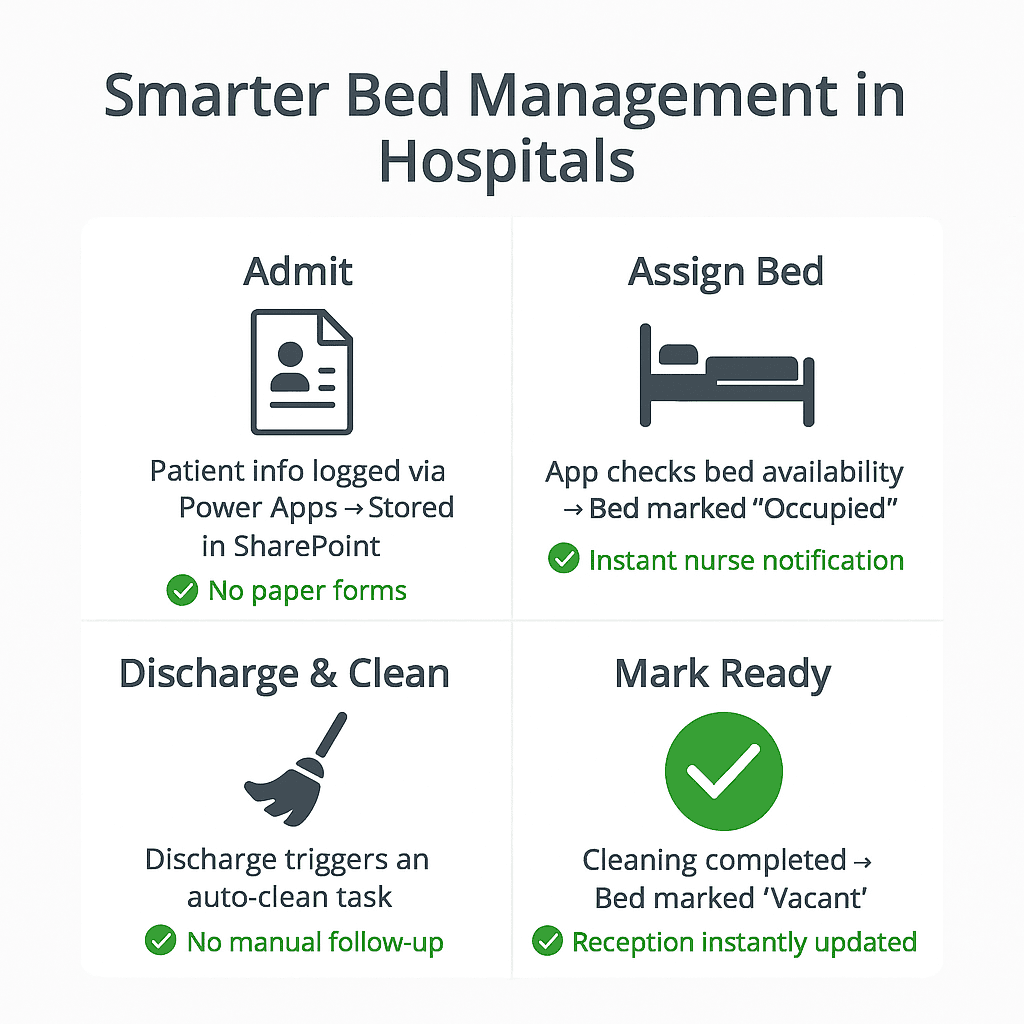
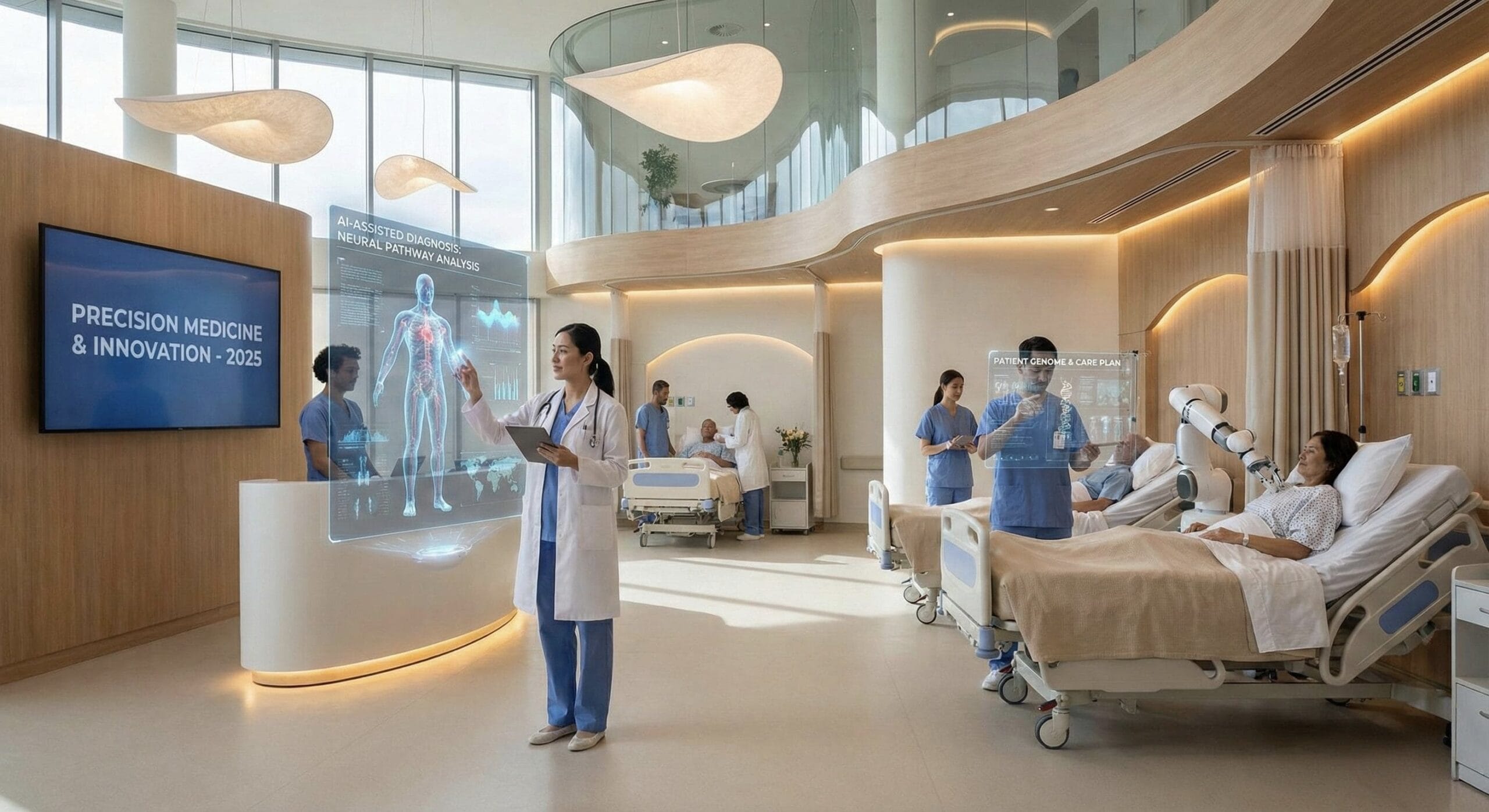
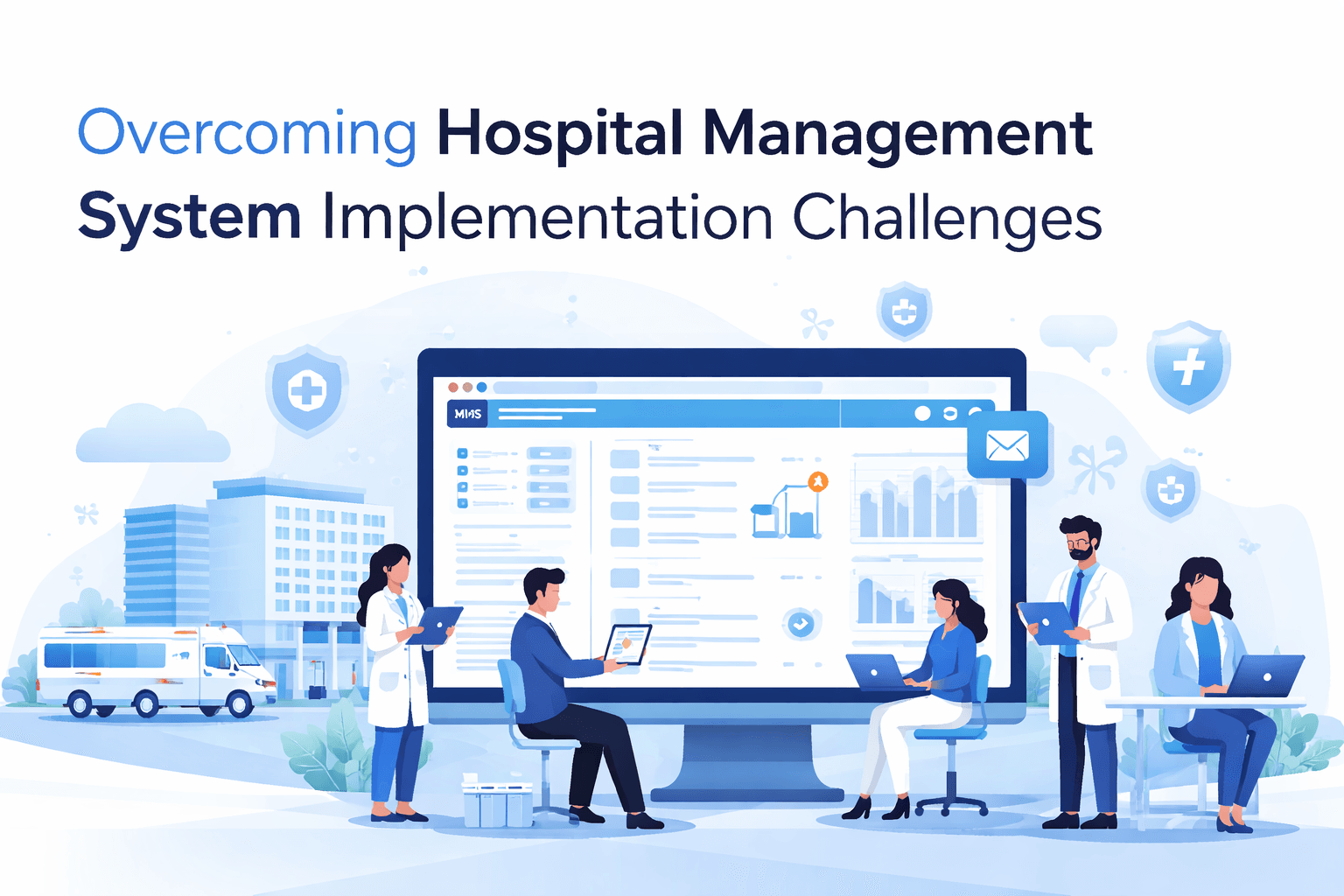
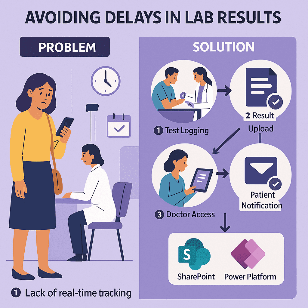
IntroductionPicture this: A patient is referred for a routine blood test.…
IntroductionIn today’s healthcare landscape, patient satisfaction and operational efficiency must go…

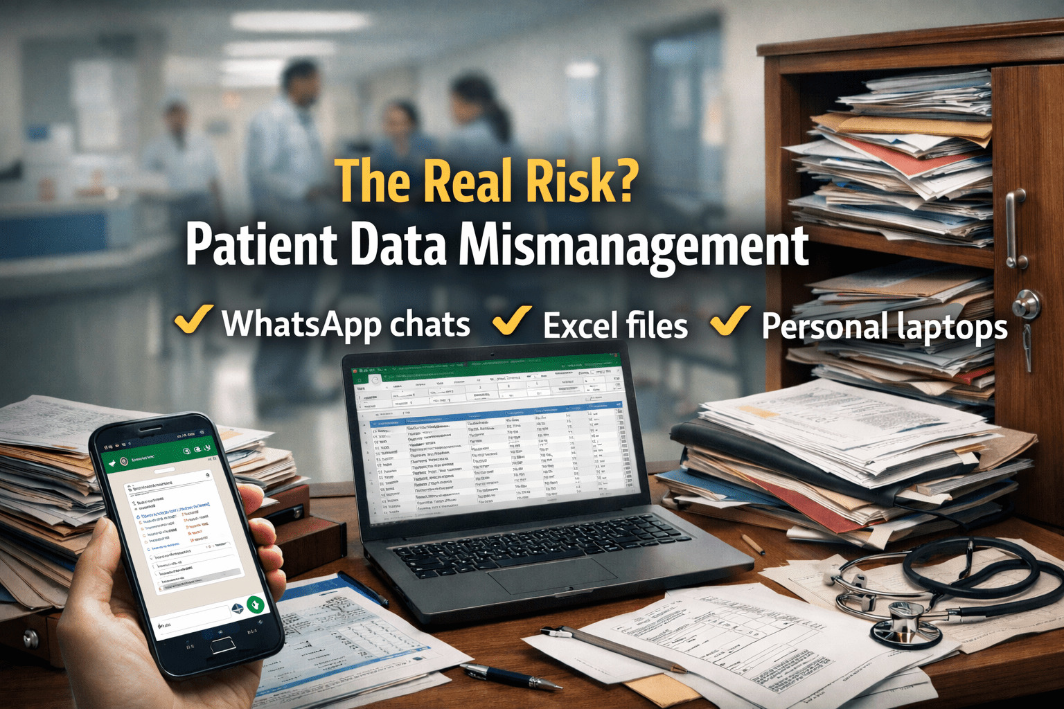
In hospitals, decisions are often made on instinct, what’s worked in…

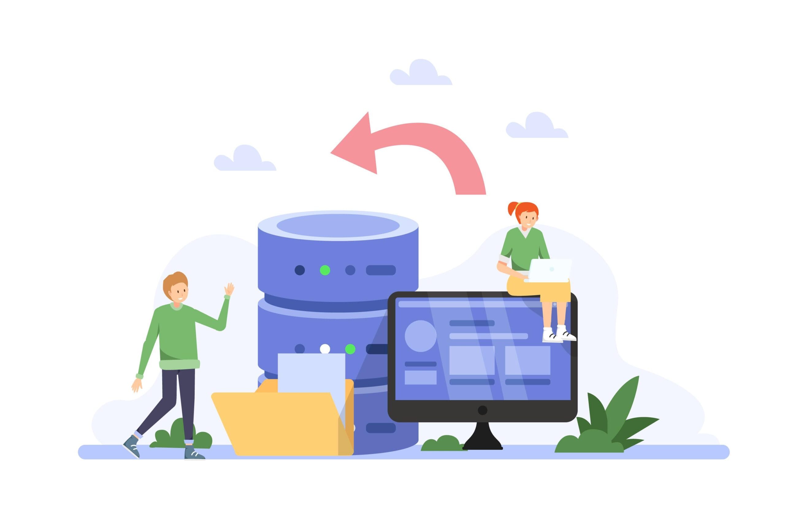
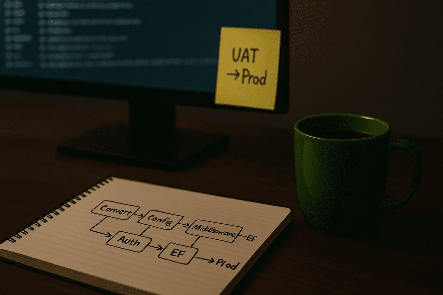
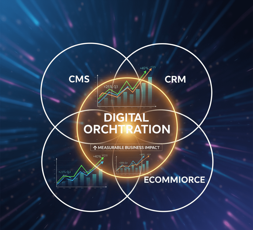
IntroductionIn today’s fast-moving enterprises, IT can’t wait months for new line-of-business…

In a world where speed and accuracy are non-negotiable, manual processes…
IntroductionPicture this: A patient is referred for a routine blood test.…
IntroductionIn today’s healthcare landscape, patient satisfaction and operational efficiency must go…
In hospitals, decisions are often made on instinct, what’s worked in…
Recent Articles
Get News & Blog
Lorem ipsum dolor amet consectetur adips elit sed do eiusmod tempor incididunt laboey dolore magna aliqua enim minim
On the other hand, we denounce righteous indignation and dislike men who are beguiled and demoralized by the charms

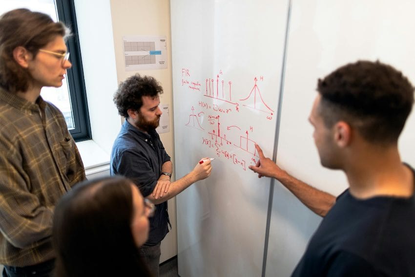
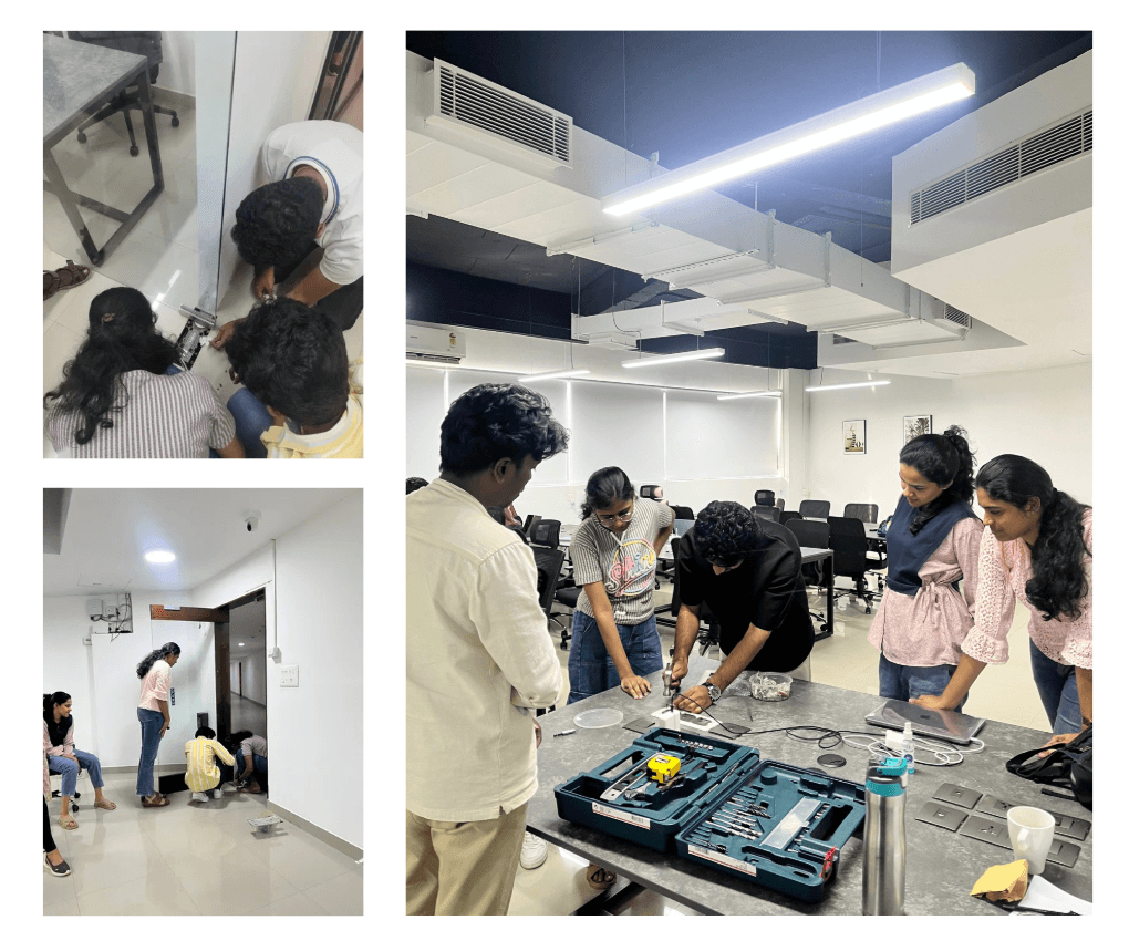
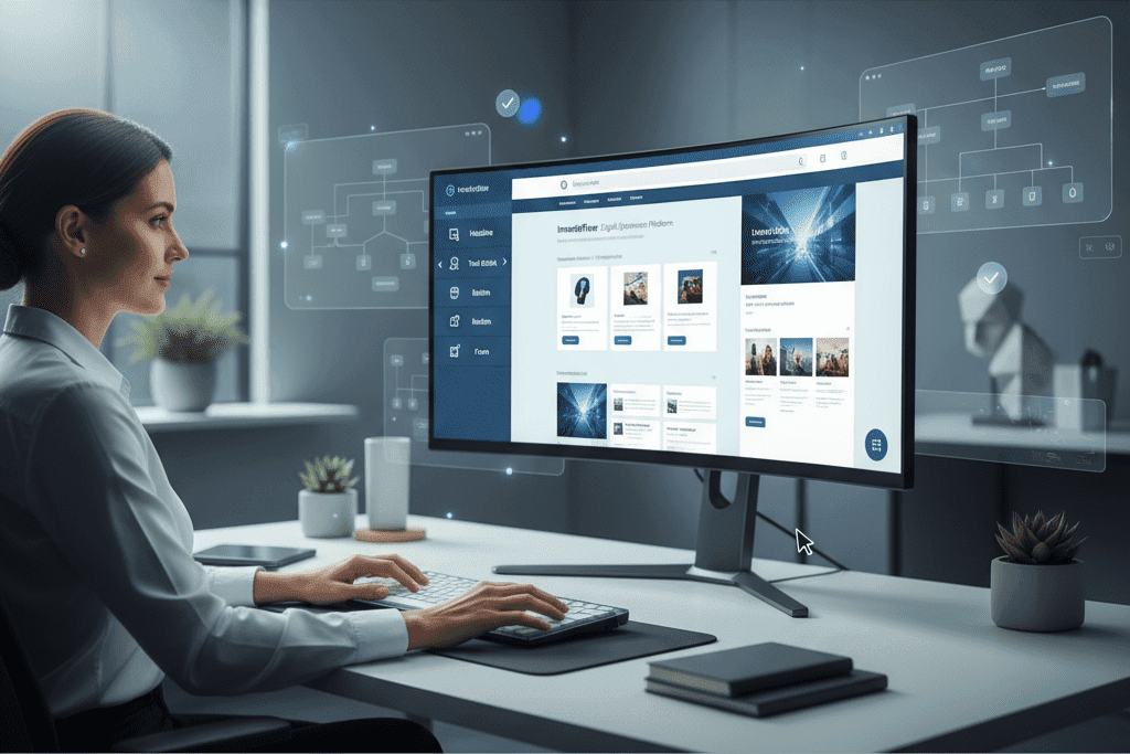
In 2024, a leading university approached us with a challenge:…
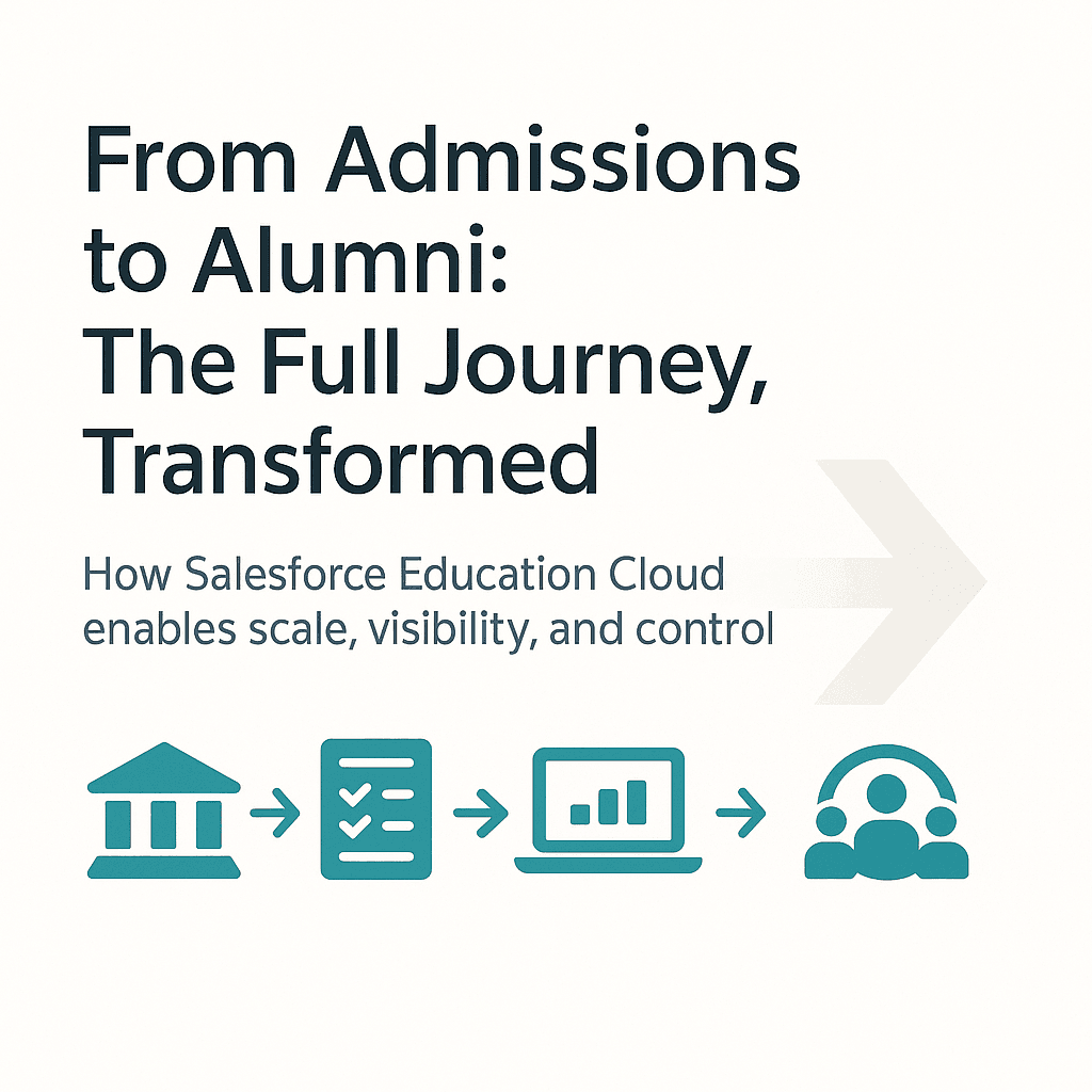
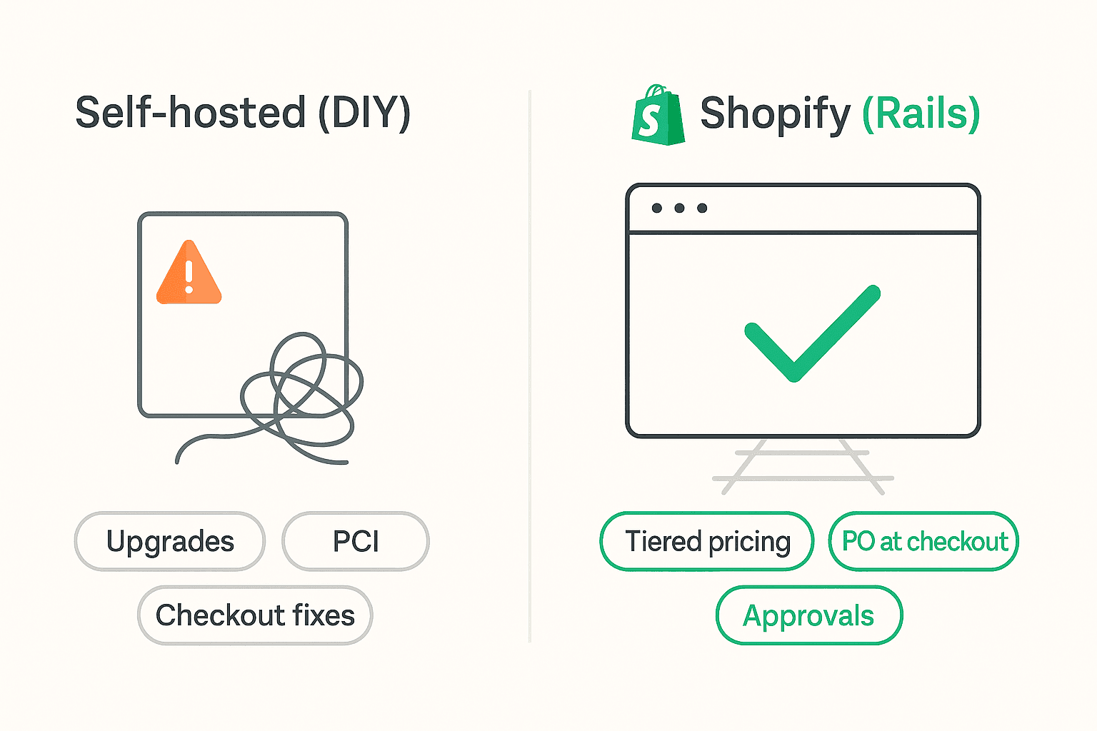
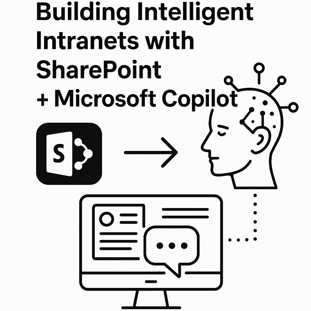
In the realm of digital experience platforms, Sitefinity stands out…
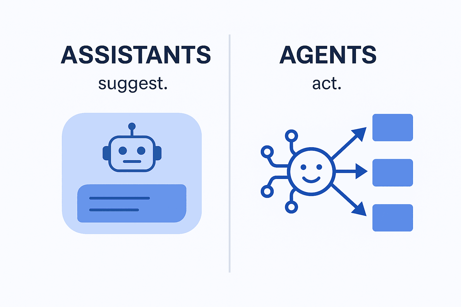
In today's rapidly evolving digital landscape, organizations are re-evaluating their…
Blog & News
Get Update for Data Science
68,000 client Trusted Restly